Agenda for iOS review: A fresh approach on note-taking
What happens when you combine notes, task management, and a calendar into a single app? You get an Agenda.
No matter who you are, notes are a necessity for everyone, regardless of profession. Honestly, no one has a perfect brain and little details get lost in translation as life goes on, so notes are an essential part of everyday life. At least that's how I think of it.
Even though it's been years since I graduated from college, I often find myself taking notes for other reasons. Whether it's little details I need to remember from phone calls when setting up appointments or meetings to ideas and thoughts for my big upcoming events (wedding planning is exhausting), I need a fast way to jot down notes.
Agenda originally came out on the Mac back in January, but I only discovered it about a month after it came out. I instantly fell in love with the unique way it handled notes, but there was one thing missing that prevented me from using it full-time: an iOS version. For a note-taking app, I need it available on all platforms, and when it was only on Mac, it was fairly limiting.
But now the iOS version is out, so how does it affect my workflow? Let's find out!
What is Agenda?
Agenda is one of the most interesting note-taking apps out there on the market. It's a combination of task management, calendar, and a text editor, all in one magical app to help you stay organized and capture notes fast. Because of its unique system, it's incredibly flexible to adapt to your workflow.
With Agenda, users are able to create categories and projects to organize all of their notes in. As you make notes in these projects, they're organized chronologically in a timeline. This design is intentional to help you move forward with your projects and tasks.
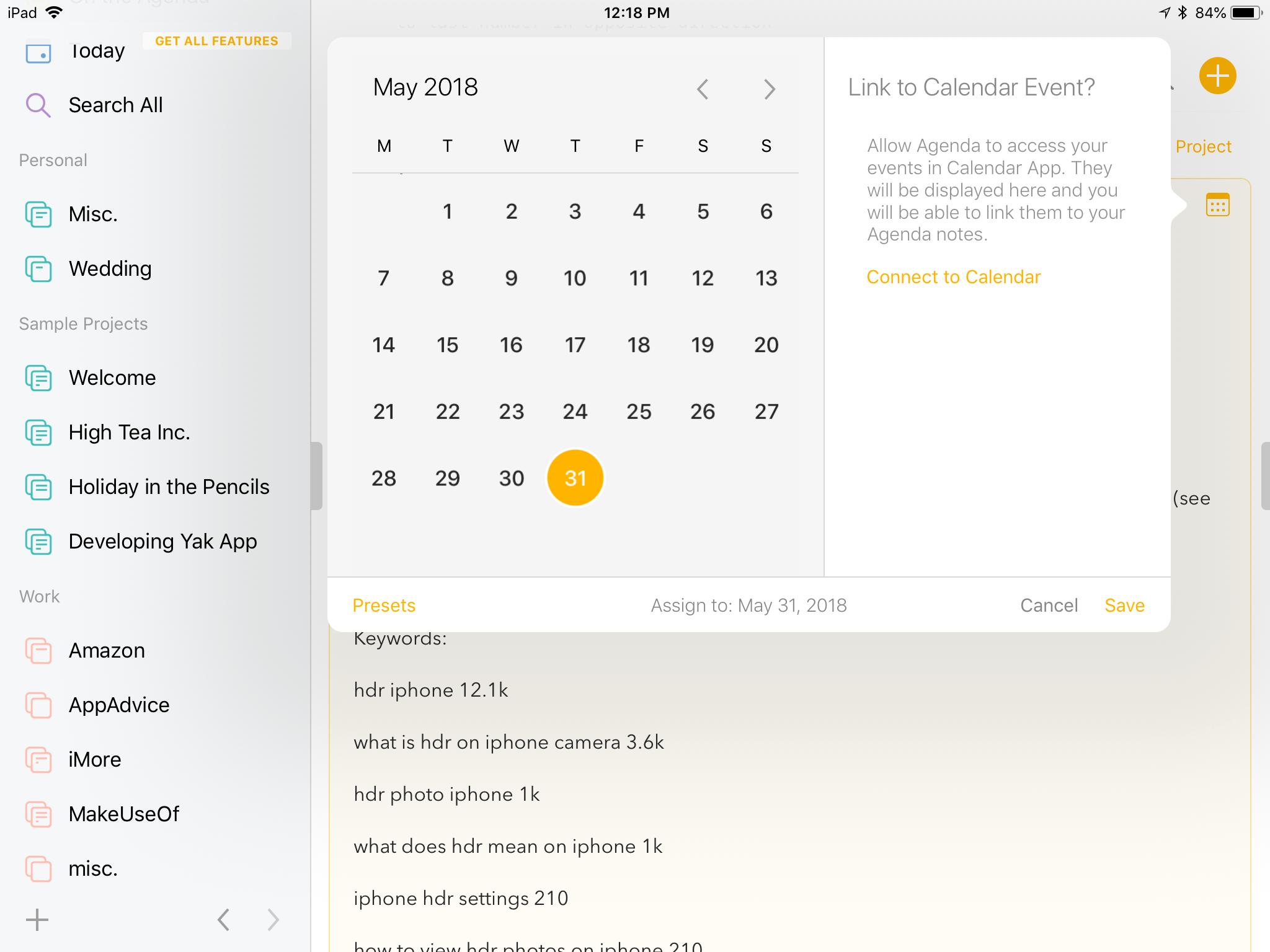
Since Agenda is a combination of task management and calendars, you can even assign due dates to notes or link them to calendar events to help you stay on track. And the flexibility of being a full-fledged rich text editor means your notes can become checklists, code snippets, journal entries, or whatever else you can think of.
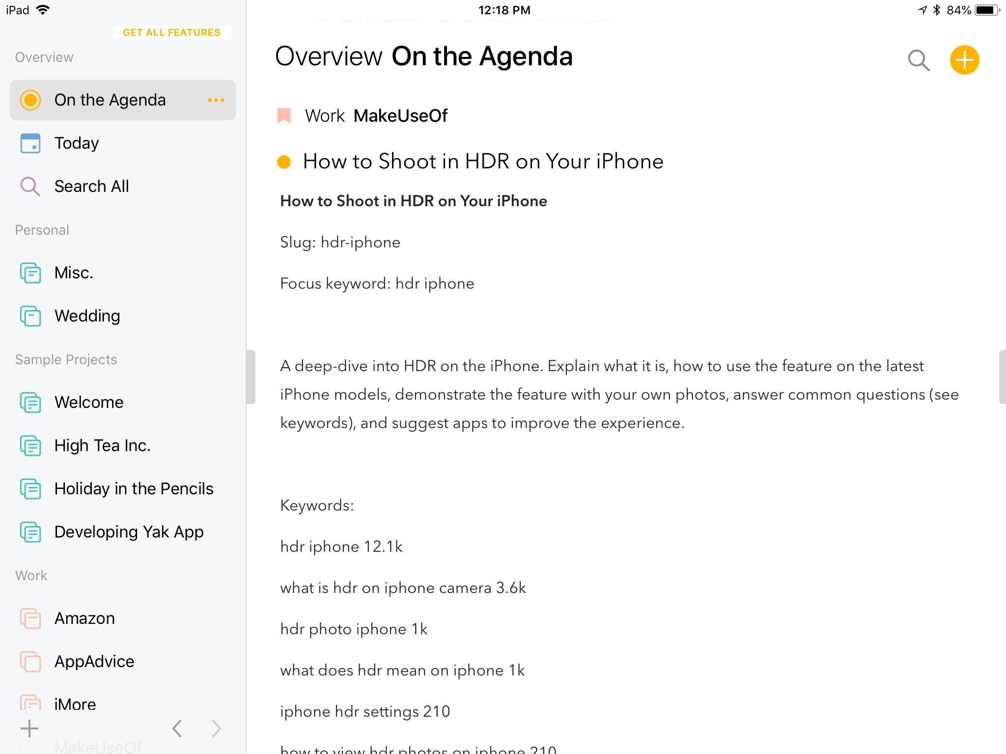
Usually, when you create a new note or give it a due date, it becomes labeled as "On the Agenda". The agenda serves as a complete timeline of your notes that matter, and you can see in a glance what needs doing.
Yes, Agenda sounds a bit weird and complicated, but in reality it's not. It's adaptable and works with you, not against you. However, to find a workflow that suits your needs may take some experimentation.
Design and interface
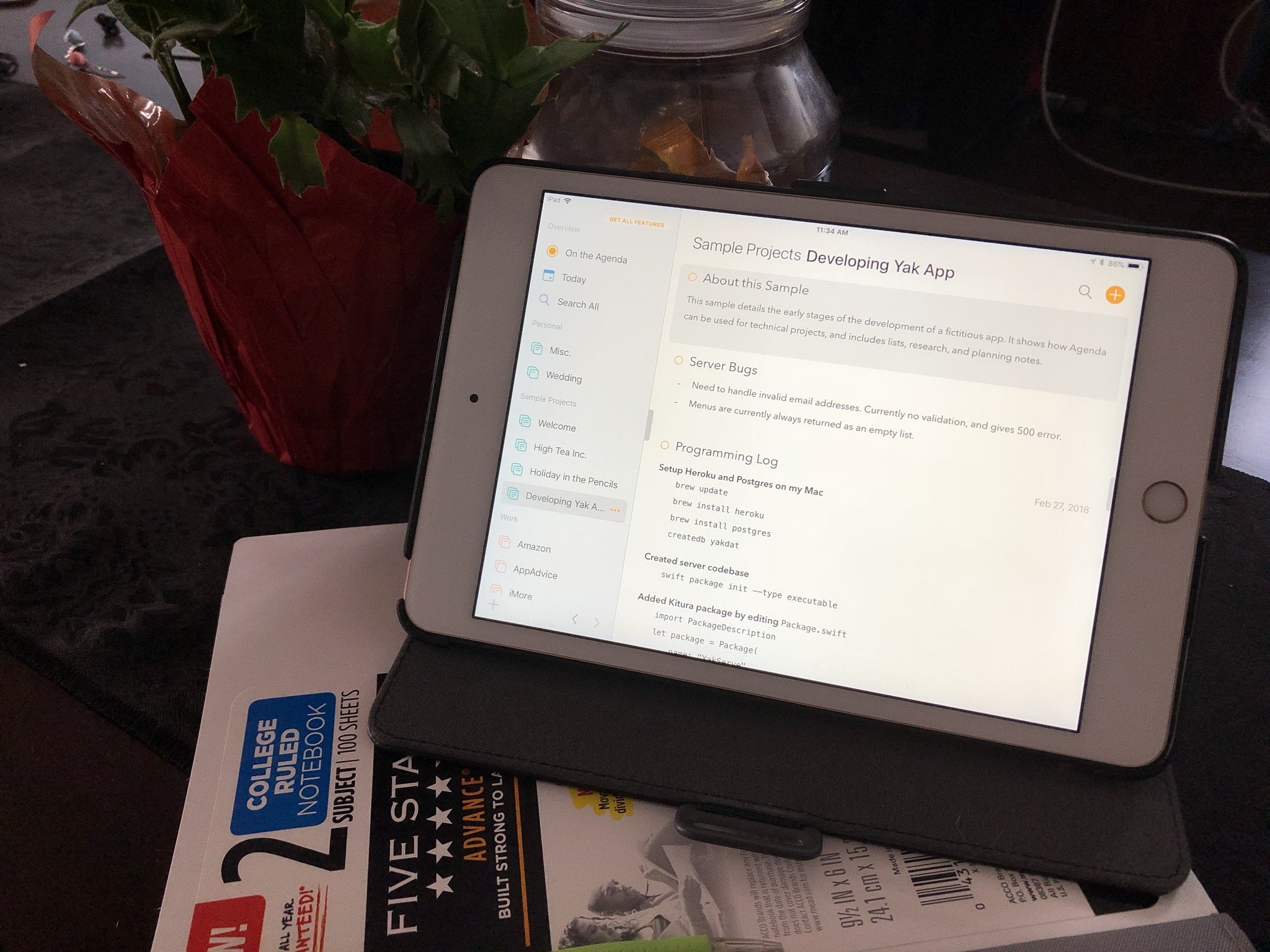
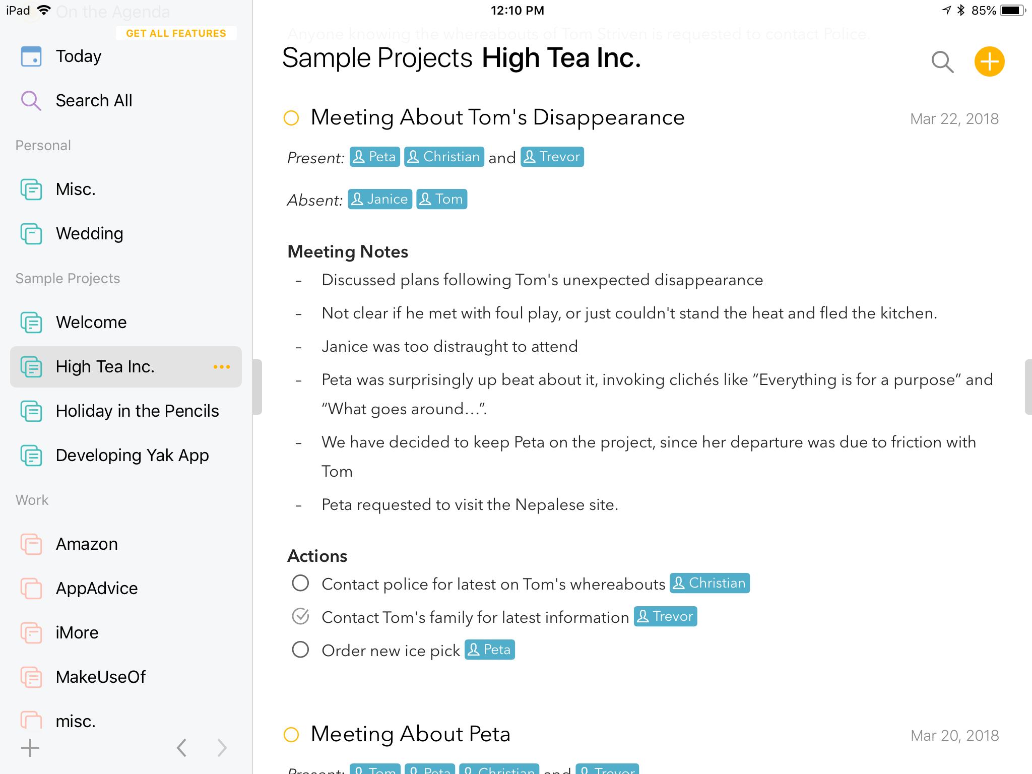
If you've been using Agenda on your Mac, then you'll be happy to know that the iOS apps look exactly the same as the Mac version. Of course, it's best suited for the iPad's larger screen since it displays more at once, but the iPhone's single pane view works well too.
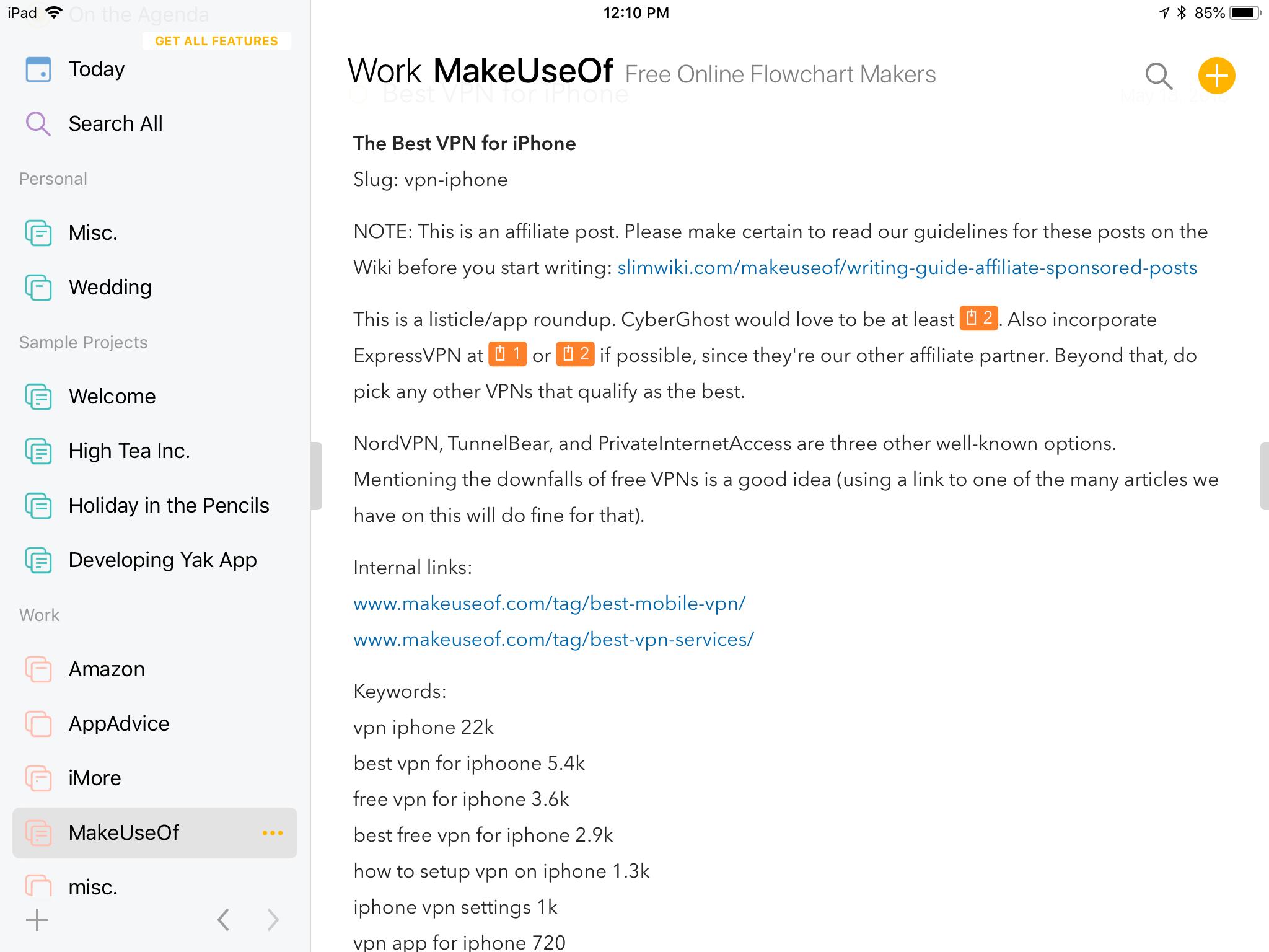
The left pane is the sidebar, and it houses all of your organizational categories and projects. You can create new categories or projects by tapping on the "+" button in the bottom left corner of the sidebar.
When adding a new category, give it a name and then choose a color. All projects added to your categories get labeled with that selected color as well, so everything is clearly color-coded to easily differentiate from each other.
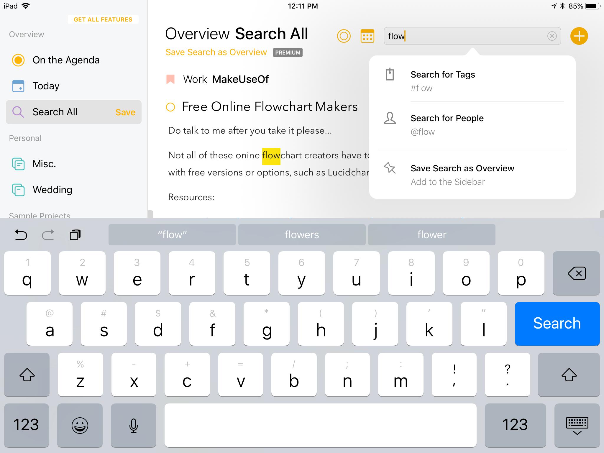
Also, there are three omnipresent sections that you're always able to access from the sidebar: On the Agenda, Today, and Search All. These three sections are to help you stay on task, since you can see what's in the pipeline or what needs completed today. Search All is useful when you need to find certain keywords, and it searches through all of the text, not just projects or titles.
The only thing I've noticed with the search function is that it seems to lag a bit while you type. I believe this is because the app has to go through all of your notes, which can be a more straining process if there are more notes in the collection. It's not a huge deal since the feature works as intended, but I just wish the typing was a bit smoother.
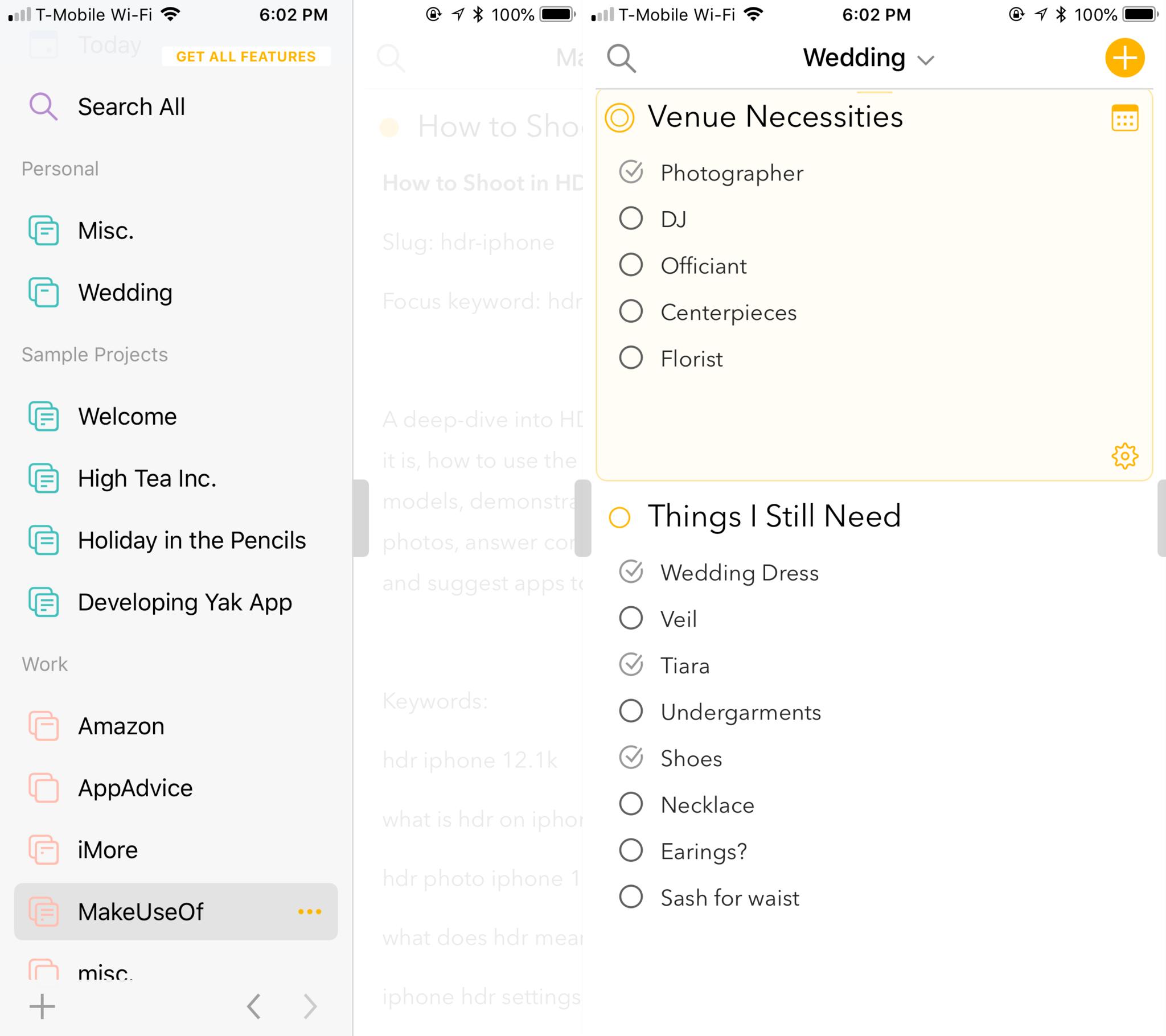
On the iPad, you can have the side panel and the notes side-by-side on the screen due to the larger screen estate. However, you can opt to hide the side panel by dragging the handle to the left. With the iPhone, you can get a similar view only when your device is in Landscape orientation. If you're in Portrait, the notes view will always be in full screen, and you can peek at the side panel by swiping the handle to the right.
Once you begin to accrue a lot of notes in Agenda, navigating can become a pain. Instead of scrolling through everything, just tap the project name at the top of the screen. You'll get a lit of all of the notes you've put into that project, and a solid orange dot or outline indicates if it's "on the agenda" or not. Tap the title of the note you want to view, and it takes you to it.
If you need to assign a due date or link a note to a calendar event, just tap on the calendar icon for the selected note. Agenda also supports formatted text for your notes, and a keyboard extension provides quick and easy access to headings, sub-headings, and even preformatted text (like code).
Finding your flow
Agenda is a peculiar note-taking app, that's for sure. It's unlike anything I've used before, but I love it. When I first downloaded and started using Agenda on my Mac, it took me some time to figure out how to fit it into my workflow.
If you're like me and need a nudge to figure out how to get Agenda to work for you, don't fret — there's some sample projects included in the download to get you started. These serve as a guide on how you can utilize Agenda, and believe me, it's fairly flexible.
Personally, I created some categories in Agenda to fit my lifestyle: Personal and Work. Personal includes a generic "Misc." project for various thoughts, ideas, and other quick things I need to jot down. I also have a "Wedding" project that holds all of my wedding planning (i.e. things I still need).
For my Work category, I've created a project for each job I have. For my writing gigs, this is where I house article ideas and keep research notes for each one. Since these also have deadlines, I give these notes a due date and have them "on the agenda," so I know what's coming up when I launch the app.
As I complete articles and other noted tasks, I make sure to tap on the solid orange circle to take it off the agenda. Since the Today and On the Agenda views work similarly to task management apps, tapping that dot is like marking it as complete, removing it from the timeline. You can still reference it later if needed, but it reduces the clutter and helps you focus on what remains.
At first I wasn't sure about Agenda, but as I began to use it daily on my Mac, I was yearning for a version on my iPhone and iPad. Now that we have them, it's complete, and I've decided to use it full-time for organizing my important notes with deadlines. For quick captures, I still like to use Drafts.
Another thing to note is the fact that Agenda uses iCloud syncing to keep all of your data intact across all devices. It's fast, seamless, and I've had no issues with it.
Agenda Premium
While Agenda's core features are completely free to use, you'll get bonus features if you go for the Premium subscription.
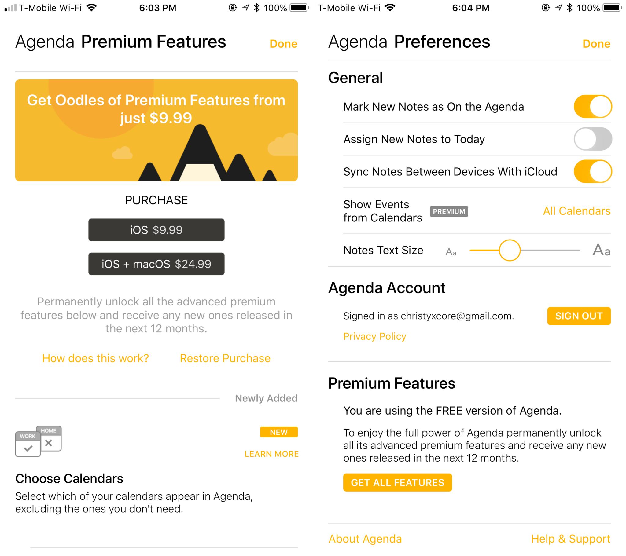
The thing about Agenda's subscription model that's unique is the fact that it works like a magazine. When you subscribe, you'll get all of the current premium features, as well as any new ones added in the next 12 months. If you opt out of your subscription when it comes time to renew, you still get to keep the previous features you've unlocked, but you just don't get new ones for the next 12 months.
What makes Premium worth it? You'll get features like the ability to choose which calendars show up in the app, getting rid of the ones that don't matter. You'll also be able to pin notes to the top of projects, create calendar events directly, save searches, copy and export Markdown, and hide watermarks for printing and PDFs.
If you're interested in getting Agenda Premium, it's $24.99 for 12 months for both Mac and iOS. If you're only interested in the iOS version, it's $9.99 a year.
My verdict
Like I've mentioned earlier, now that Agenda is available on iOS, I'm using it full time for most of my notes. The design of it is simple and intuitive once you get the hang of things, and I truly enjoy being able to assign due dates to notes. It's useful for this line of work, and the iCloud sync is practically seamless and invisible.
It's definitely a flexible note-taking app that can work with you if you experiment a little, since it combines three productivity apps in one. But it's completely free to download and use, with some useful bonus features if you decide to dive in completely.
from iMore - Learn more. Be more. http://bit.ly/2Ja2aZv
Powered by IOSCUBE
No comments: