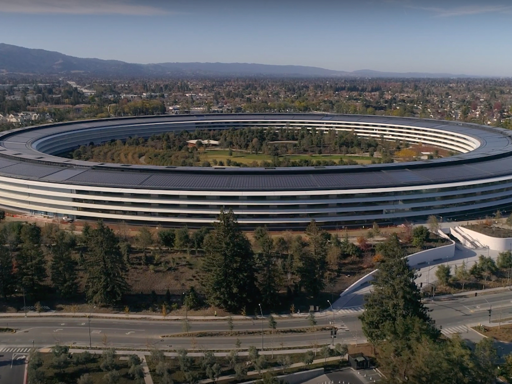
Twitter user shares ways Apple Park caters to visitors with disabilities
A guest visiting Apple Park says that the campus is "a demonstration of an accessible building when cost is no object."
Though Apple is known for the wide array of accessibility options in iOS, one individual has confirmed that the company's commitment to the principle extends far beyond the iPhone screen. On a trip to Apple Park's visitor center, Twitter user @xarph composed a thread of tweets detailing nine ways that Apple designed the location to cater to blind individuals who use canes, partially-sighted individuals, and those who use wheelchairs, saying "Basically, go to the Apple Park Visitor's Center if you want to see how to design a building for maximum disabled access when cost is no object."
@xarph began by describing the advantages of the motion-activated exterior doors that serve as the entrance to the center:
Every exterior door has motion-activated auto-open triggers that can trigger on both wheelchair and foot height, placed away from the door. Usually the button (when it's working; often it's not) is mounted to the frame and is awkward to press from a wheelchair.
They also touched on the store's layout, describing how there's no annoying, possibly awkward alternate ways of browsing Apple's wares:
Extremely wide open spaces on the interior. There are no "alternate paths" for wheelchairs or assist devices. If you can walk there, you can roll there … All of the visitor center merchandise is stored on shelves at wheelchair height. No racks with stuff hanging above your head.
The accessibility isn't only limited to the store, however. @xarph also discusses rooftop railings with integrated lighting features to assist partially-sighted guests, as well as floor-mounted rails indoors so blind individuals who use canes don't accidentally "stray into low-overhead areas." Additionally, there are separate restrooms designed specifically for disabled guests, complete with low-mounted fixtures and wide stalls. Even the parking lot is well thought out:
Instead of ramps, the entire structure is built on the exact level as the parking lot. Usually buildings are a curb-height higher since it's cheaper to use an elevated concrete pad than get the earth at the site completely flat for the foundation.
However, Apple didn't get everything right. @xarph mentions that the water faucet in the center's coffee bar cannot be reached from a wheelchair:
The only case of a facility that could not be used by both able-bodied and disabled people was the water faucet at the coffee bar. It's mounted too far back to reach from a wheelchair. Disabled folks have to use one of the standard water fountains near the restrooms.
If you're interested in checking out all the photos and tweets for yourself, you should absolutely take a look at @xarph's entire thread. If you struggle with reading threads on the native Twitter site, there's also an unrolled version posted on Thread Reader here.
For more information regarding Apple's commitment to accessibility, you can visit the company's dedicated accessibility page.
Thoughts?
Do you feel the tech companies you love value accessibility? Share your thoughts in the comments below.
from iMore - Learn more. Be more. http://bit.ly/2EY2QTE
Powered by IOSCUBE

No comments: